A small feature on a Spanish fashion app made me think about a much bigger question for anyone building websites and digital products: are we designing around what technology assumes about people, or giving people enough room to tell us what they actually need?
I live in Spain. I speak Spanish. And I still sometimes want to use English.
That really shouldn't be a complicated concept for a website or app to understand.
Recently, while using the Lefties app in Spain, something very small caught my attention.
Not a product. Not a promotion. Not some impressive AI-powered feature.
It was simply this:
The app lets me choose my region and my language separately.
If you're more familiar with Australia, I would roughly compare Lefties to something in the Cotton On space: accessible fashion, physical stores, a broad customer base and a strong digital shopping experience.
What interested me wasn't really the language selector itself. It was the thinking behind it.
And it made me wonder:
Why isn't this kind of user choice a standard consideration when we build websites and apps?
Because the more I thought about it, the more I realised this isn't only about language.
It's about assumptions.
Your location tells me where you are. It doesn't necessarily tell me what you want.
If I'm shopping from Spain, it makes complete sense for a website to recognise that.
Show me:
- prices in euros
- products available in Spain
- local delivery options
- relevant payment methods
- tax information
- customer support for the Spanish market
- regional promotions
That's useful localisation.
But automatically deciding that I therefore want to browse in Spanish is a different decision.
I might live in Spain and prefer English. I might be a tourist. An international student. An expat. Someone temporarily working in another country.
Or I might simply prefer using certain apps and websites in English.
Location is context. Language is preference.
It sounds like a small distinction. But from a customer experience perspective, I think it matters.
What Lefties gets right
What I liked about Lefties was how uncomplicated the solution was.
Choose your region. Choose your language. Done.
No sophisticated personalisation system required.
And perhaps that's exactly why it caught my attention.
We talk so much about AI, predictive technology, recommendation engines, automation and hyper-personalisation.
All of those things have a place.
But sometimes better customer experience is simply about giving someone an obvious choice.
"Where are you?"
and
"What language would you like to use?"
They are related questions. But they are not the same question.
That difference gives the customer a little more control over the experience.
ASOS made me notice the contrast
This is something I've also noticed when using ASOS.
International ecommerce websites obviously need to adapt to the customer's market.
A Spanish customer needs the correct shipping options, stock availability, prices, returns conditions and other commercial information for Spain.
That part makes complete sense.
But market and language don't always need to be locked together.
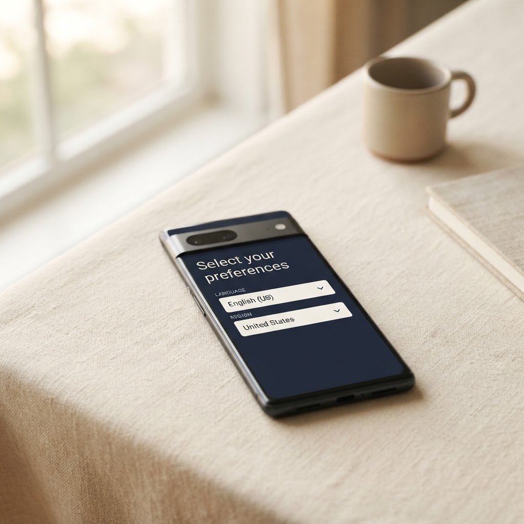
A customer could need Spanish delivery options and euro pricing while still preferring the interface in English.
Someone shopping from Germany could prefer Spanish. Someone in France could prefer English.
The world is increasingly international, and the way people live doesn't fit neatly into:
Country = language = preference.
That's why I like the Lefties approach.
The system can understand where I am without assuming that one piece of information explains everything else about me.
Defaults are useful. Restrictions are not.
I'm definitely not against automatic detection. Actually, I think it's useful.
If I open a website in Spain and it starts in Spanish, that's completely reasonable.
The problem starts when the default becomes difficult or impossible to change.
Technology can make a prediction.
The user should still be able to say:
"Actually, I'd prefer something else."
Imagine walking into a shop in Spain.
Someone starts speaking Spanish to you. Completely normal.
Then you say:
"Could we speak English?"
And they reply:
"No. You're in Spain."
That would be a pretty strange customer experience.
Why should a digital interaction feel different?
The better approach seems simple:
Detect. Suggest. Let me adjust. Remember my choice.
If I'm in Spain, suggest Spain.
If my browser settings suggest Spanish, start with Spanish.
But if I select English, remember that preference.
Please don't make me correct the same assumption every time I return.
But language is only one example
This is where my thinking started to go beyond Lefties.
What other assumptions are interfaces making about us?
And how easy is it for us to correct those assumptions?
Take accessibility.
One person may need larger text. Someone else might need stronger contrast.
Another user may prefer reduced motion because constant animation makes the experience difficult or uncomfortable.
Someone may rely on keyboard navigation, captions, screen readers or alternative input methods.
A person with limited motor control might benefit from larger interaction areas.
Someone with cognitive or neurodivergent needs might find clearer navigation, less visual clutter or simpler information hierarchy easier to work with.
And sometimes the need isn't permanent at all.
You could simply be:
- using your phone outside in bright sunlight
- holding it with one hand
- travelling
- working somewhere noisy
- reading in a second language
- temporarily injured
- tired
- distracted
- completely new to the product
That's what makes this interesting to me.
Accessibility isn't necessarily a completely separate conversation from everyday UX.
Many things that make products more accessible also make them easier for a much wider group of people to use.
Clear typography. Good contrast. Predictable navigation. Captions. Enough space around buttons. Reduced visual noise. Control over motion. A clear information hierarchy.
These aren't only "special features".
They can simply be signs of a more supportive interface.
The blind spot: designing from our own experience
This is probably the part I find most interesting.
When we build something, it's incredibly easy to experience it from our own point of view.
We know where everything is. We understand the terminology. We probably use the language the interface was originally designed in.
We know what every icon means. We know which button to press next.
And if we don't personally need accessibility adjustments, we might never notice that something is difficult for another person to use.
That's a huge potential blind spot.
I don't think it necessarily comes from bad intentions. It's almost the opposite.
When you're very close to a product, your own experience starts feeling normal.
You can unintentionally design for:
"Someone like me."
Or perhaps for an imagined "average user."
But who is the average user?
A Spanish IP address doesn't automatically mean someone wants Spanish.
A younger customer doesn't automatically have perfect eyesight.
A returning user doesn't necessarily want fewer instructions.
Someone who used an interface easily yesterday might be using it under completely different circumstances today.
Our own experience is only one version of the experience.
And I think remembering that is important.
I'm looking at this from the customer side
I should also be clear here:
I'm not a UX/UI professional.
I'm not trying to tell accessibility specialists or product designers how to do their jobs.
I'm learning more about this area myself through building things, using digital products, observing customer journeys and paying more attention to the moments where an experience feels surprisingly easy or unnecessarily difficult.
So this is very much an observation from the user side.
And perhaps that is also why I'm interested in it.
I'm starting with a very simple question:
"Why did this small thing make the experience feel better for me?"
With Lefties, the answer was control.
The system didn't force my location and my language preference to mean the same thing.
That then made me wonder where else we make similar assumptions when designing digital experiences.
I don't have all the answers. But I think it's a worthwhile discussion.
Personalisation is not the same as understanding
The digital industry talks constantly about personalisation.
And there's good reason for that.
Personalisation can remove friction. It can make recommendations more relevant. It can surface useful content. It can make an experience feel faster and more intelligent.
But I think there's an important limitation.
Knowing more data about someone doesn't necessarily mean understanding that person.
A system may know my location. It doesn't necessarily know my preferred language.
It may know what I purchased last week. It doesn't necessarily know what I need today.
It may know which device I'm using. It doesn't necessarily know whether the default text size is comfortable for me.
This is why prediction and user choice should probably work together.
A personalised interface says:
"Based on what we know, this is what we think you want."
A supportive interface adds:
"But if we're wrong, here's an easy way to change it."
I like that second version much more.
Localisation, personalisation and accessibility
I think these ideas can be separated into three useful questions.
Localisation asks:
"How should this product work for people in this market?"
Personalisation asks:
"How can this product adapt to this particular person?"
And accessibility and inclusive design introduce another question:
"How can we make sure different people are actually able to use this experience?"
They overlap. But they aren't interchangeable.
And the important part, for me, is that none of them should rely too heavily on assumptions.
This isn't only relevant to ecommerce brands such as Lefties and ASOS.
The same thinking can apply to:
- SaaS platforms
- banking apps
- travel websites
- booking platforms
- universities
- government services
- healthcare platforms
- marketplaces
- customer portals
- B2B software
Basically, anywhere a human being has to interact with a digital interface.
Maybe we need more supportive interfaces
The word I keep coming back to is supportive.
A supportive interface doesn't need to ask the customer fifty questions before they can use it.
That would be terrible UX too.
It still uses sensible defaults. It still takes advantage of technology. It still removes unnecessary friction.
But it also recognises:
We might be wrong.
So if the interface starts in Spanish, let me choose English.
If the default text works for most people, make sure someone who needs larger text can still use the product.
If animation improves the experience for many people, consider people who prefer reduced motion.
If the interface contains a lot of information, think about whether the hierarchy makes it understandable to someone seeing it for the first time.
Not every setting needs to be customisable.
Too much choice can become another kind of complexity.
The goal isn't to create a control panel for absolutely everything.
The goal is to recognise where an assumption could materially affect someone's ability to understand, navigate or comfortably use the product.
And where it matters, give them a way to change it.
The bigger lesson I took from Lefties
In the end, this wasn't really about a language selector.
It was about what that language selector represents.
Where I am and what I prefer are not necessarily the same thing.
That feels obvious when you write it down.
But I think it exposes a much bigger design question.
What else are we assuming?
Who are we unconsciously designing for?
And who might we be leaving out because their preferences, abilities or circumstances don't match our default?
Use technology to make intelligent assumptions.
Use localisation to make experiences relevant.
Use personalisation to reduce friction.
Use accessibility and inclusive design to make products usable by more people.
But leave enough room for the person behind the screen to say:
"Actually, this works better for me."
Sometimes the best personalisation isn't another algorithm.
Sometimes it's simply giving people that choice.
My takeaway
I'm still learning about UX, accessibility and inclusive digital experiences, so I'm interested in this more as a user and someone building digital things than as an expert.
But one principle feels increasingly clear to me:
A smart interface shouldn't only be good at making assumptions. It should also be good at being corrected.
A customer might be in Spain and prefer English.
Someone might need larger text.
Someone might prefer reduced motion.
Someone might want a simpler interface.
Someone else may use your product in a way you never considered during the design process.
That doesn't necessarily make them an edge case.
It might simply expose one of our own blind spots as builders.
There is always a person behind the screen.
And perhaps good UX starts by remembering that we don't know everything about them.
What small UX decision have you noticed that made a website or app significantly easier or harder for you to use?